A doorway can announce a room change without turning every adjoining wall into an accent. Three original paper elevations compare a related beige field, an ochre frame and a blue area seen through the same opening. They are digital color proposals, not photographs of painted rooms or specifications for a real door. The question is where the color change should register: across the view, at its boundary or within the room beyond.
Keep the doorway and the surrounding face fixed
All three drawings use the same outer wall rectangle and the same central opening. The surrounding face stays beige. A narrow trim shape marks the sides and top of the opening, while the area inside stands for a simplified view into another room. No door leaf, wall depth or practical alteration is modeled.
Getty’s design guide describes emphasis through differences such as color and shape. That vocabulary gives us a way to ask where attention lands, without claiming that a particular paint color produces a psychological effect. The three arrangements below are original choices, not a museum’s prescribed palette.
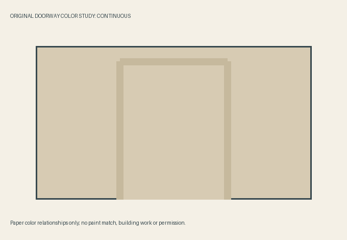
Continuous: keep the threshold quiet
The first version uses related beige tones for the wall, the trim and the view beyond. The trim is still visible as a slightly different band, so the opening has not literally vanished. What it lacks is a strong change of color at that point.
I would choose this paper proposal if the brief were to let the eye move through the opening without making the frame the main event. It does not prove that two real rooms would look continuous. Their surfaces, light and actual colors could be different even if somebody used the same paint name.
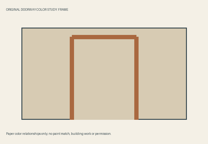
Framed: give the boundary its own color
The second version retains the beige wall and the beige view beyond, but changes the narrow trim to ochre. The warm band traces the opening’s sides and top. It makes the boundary itself more explicit while leaving the larger surrounding field unchanged.
This would be my starting point if the doorway’s outline were the feature I wanted to notice. The drawing gives it a distinct edge without proposing color over every neighboring surface. It is a comparison of visual placement, not a quantity estimate or permission to paint an existing finish.
There is also a reason to leave this version aside. If the frame already carries enough visual interest through its actual form, a separate color might be unnecessary. The paper study cannot know that detail; it has deliberately reduced the opening to a plain shape.
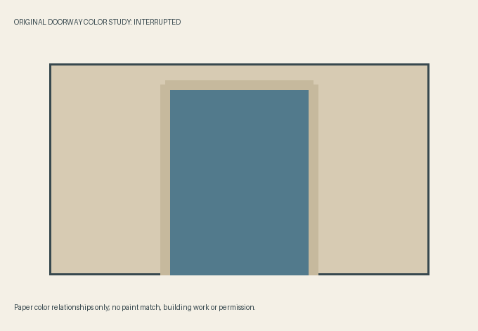
Interrupted: let the room beyond supply the change
The third version returns the trim to a related beige and puts blue inside the opening. The color change now belongs to the simplified view beyond, with the doorway acting as a boundary around it. My attention moves from the beige foreground toward that blue area rather than settling mainly on the trim.
I prefer this option when the aim is to make entering the next room a visible change while keeping the present wall comparatively quiet. The blue rectangle is a shorthand in a paper elevation. It is not evidence that one small patch of paint would create the same result in an actual room or that every surface beyond must be blue.
Turn a preference into a question for the actual space
Choose which job matters: continuity, a marked frame or a changed view beyond. Then examine the real surfaces, permissions and exact product guidance before considering work or a purchase. These screen colors do not identify products, verify compatibility or establish a match between brands.
A suitable existing finish may already support the desired relationship. There is no obligation to paint merely because the three drawings make a difference easy to see. Keep the visual brief specific enough that any actual sample or professional proposal can be judged against the same question.
Sources & further reading
Published sources for the details and examples discussed in this story.